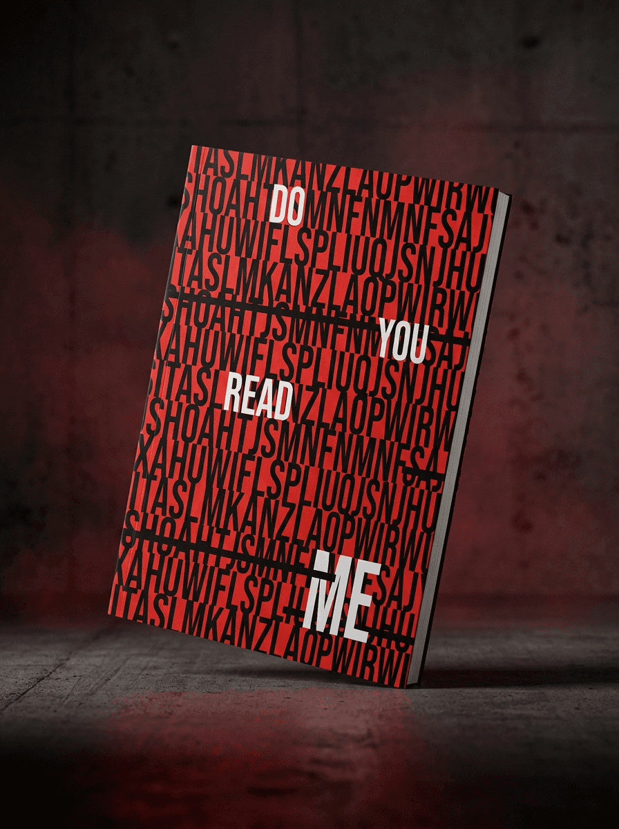
Coal & Bloom

Hero Image

(About)

Client:

COAL & BLOOM

Category:

Brand Design & Strategy

Date:

Q4 2024

Coal & Bloom is a self-initiated brand project built around contrast raw and refined, dark and expressive, structured and organic. I developed the identity, typography and visual direction into a flexible system that balances bold graphic elements with softer imagery and detail, giving the brand a distinctive personality across digital and physical touchpoints.
Placeholder Image
Placeholder Image
Placeholder Image
Placeholder Image

(Process)

(01)

Research & Positioning

Explored brands that balance premium design with a more expressive, imperfect character, using the research to define where Coal & Bloom could feel distinctive rather than overly polished.

Placeholder Image

(01)

Research & Positioning

Explored brands that balance premium design with a more expressive, imperfect character, using the research to define where Coal & Bloom could feel distinctive rather than overly polished.

Placeholder Image

(01)

Research & Positioning

Explored brands that balance premium design with a more expressive, imperfect character, using the research to define where Coal & Bloom could feel distinctive rather than overly polished.

Placeholder Image

(02)

Identity & Art Direction

Developed the logo, typography, colour palette and image direction around the contrast within the name, combining stronger structural elements with softer, more organic visuals.

Placeholder Image

(02)

Identity & Art Direction

Developed the logo, typography, colour palette and image direction around the contrast within the name, combining stronger structural elements with softer, more organic visuals.

Placeholder Image

(02)

Identity & Art Direction

Developed the logo, typography, colour palette and image direction around the contrast within the name, combining stronger structural elements with softer, more organic visuals.

Placeholder Image

(03)

Brand Applications

Applied the identity across packaging, digital content and campaign assets to test how the system could adapt while still feeling recognisably Coal & Bloom.

Placeholder Image

(03)

Brand Applications

Applied the identity across packaging, digital content and campaign assets to test how the system could adapt while still feeling recognisably Coal & Bloom.

Placeholder Image

(03)

Brand Applications

Applied the identity across packaging, digital content and campaign assets to test how the system could adapt while still feeling recognisably Coal & Bloom.

Placeholder Image

(04)

Final Brand System

Refined the strongest elements into a cohesive visual system, creating clear rules for typography, imagery, layout and colour that could scale across future brand communication.

Placeholder Image

(04)

Final Brand System

Refined the strongest elements into a cohesive visual system, creating clear rules for typography, imagery, layout and colour that could scale across future brand communication.

Placeholder Image

(04)

Final Brand System

Refined the strongest elements into a cohesive visual system, creating clear rules for typography, imagery, layout and colour that could scale across future brand communication.

Placeholder Image